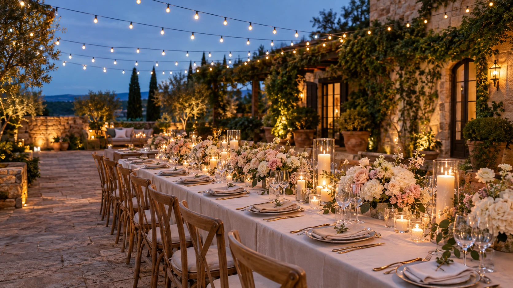

Choosing between wedding reception themes starts with a simple question: what do you want your first few minutes at the reception to feel like? A garden filled with flowers, a candlelit dining room, or a colorful party with a disco ball above the dance floor?
That feeling is a useful place to start. Your theme gives the celebration a direction, connecting the tables, lighting, flowers, stationery, and little details guests notice throughout the evening.
It can be as simple as a relaxed Italian dinner or as theatrical as a midnight sky filled with stars. You do not need to decorate every corner to make the idea clear.
Below, you will find 21 wedding reception theme ideas with color palettes, styling suggestions, and practical details to help you build a version that suits your venue. Save the ones you love, then narrow your favorites down to the atmosphere you would actually enjoy celebrating in.
If you are also planning what to wear, explore our dream wedding dresses and attire ideas alongside your reception mood board.
Wedding Reception Themes at a Glance
| If you love… | Start with these themes | Details that set the mood |
|---|---|---|
| Soft, romantic surroundings | Garden party, pearls and bows | Loose flowers, pale linens, delicate accents |
| Long conversations over dinner | Candlelit supper club, Parisian bistro | Warm lighting, intimate tables, a thoughtful menu |
| Relaxed outdoor celebrations | Rustic countryside, backyard brunch | Wood, comfortable seating, casual food service |
| Nature and greenery | Wildflower meadow, greenhouse, woodland | Seasonal flowers, foliage, natural textures |
| Clean, elegant decor | Modern black and white, coastal blue and white | A restrained palette and repeated shapes |
| A lively dance floor | Disco garden, colorful retro | Reflective details, bold color, room to dance |
| Rich evening colors | Jewel-tone glamour, celestial | Velvet accents, metallic details, layered lighting |
| A personal story | Literary romance, Italian lemon | Favorite books, meaningful places, shared memories |
1. Romantic Garden Party
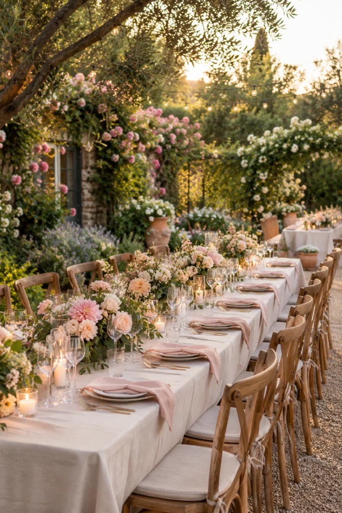
Color palette: Blush, ivory, sage, and pale peach. Best suited to: Garden venues, lawns, courtyards, and bright conservatories.
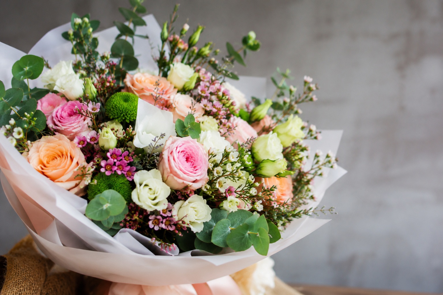
A garden party reception feels like a beautiful outdoor dinner that happens to be your wedding. Start with softly draped tables, garden-style flower arrangements, and chairs that let the surrounding greenery remain visible.
Choose low arrangements with a little movement rather than identical round bouquets. A few flowering branches near the entrance can introduce the theme before guests reach their tables.
For a personal touch, give each table the name of a flower connected to your relationship or family garden.
Make it work: Design the covered or indoor backup with the same palette. Your favorite part of the look should survive a change in weather.
2. Candlelit Supper Club
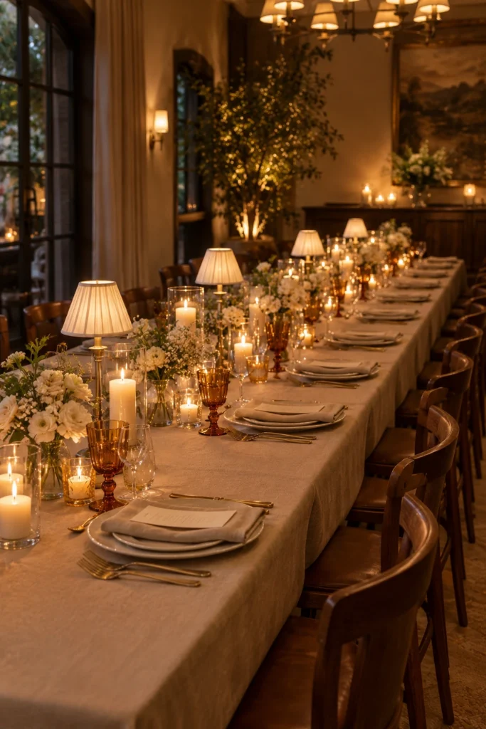
Color palette: Ivory, warm taupe, amber, and deep brown. Best suited to: Private dining rooms, intimate event spaces, and evening receptions.
If your ideal celebration involves excellent food and staying at the table for one more conversation, try a supper club theme. Give each place setting a folded napkin, a simple menu, and glassware that catches the light.
Use small table lamps and clusters of candles to create pools of warmth. Keep flowers low and leave space for the meal to take center stage.
A handwritten note at each place can make a small reception especially memorable. For a larger guest list, write one welcome note for each table.
Make it work: Ask the venue which candles are permitted. Warm LED candles can carry the look where open flames are restricted.
3. Rustic Countryside
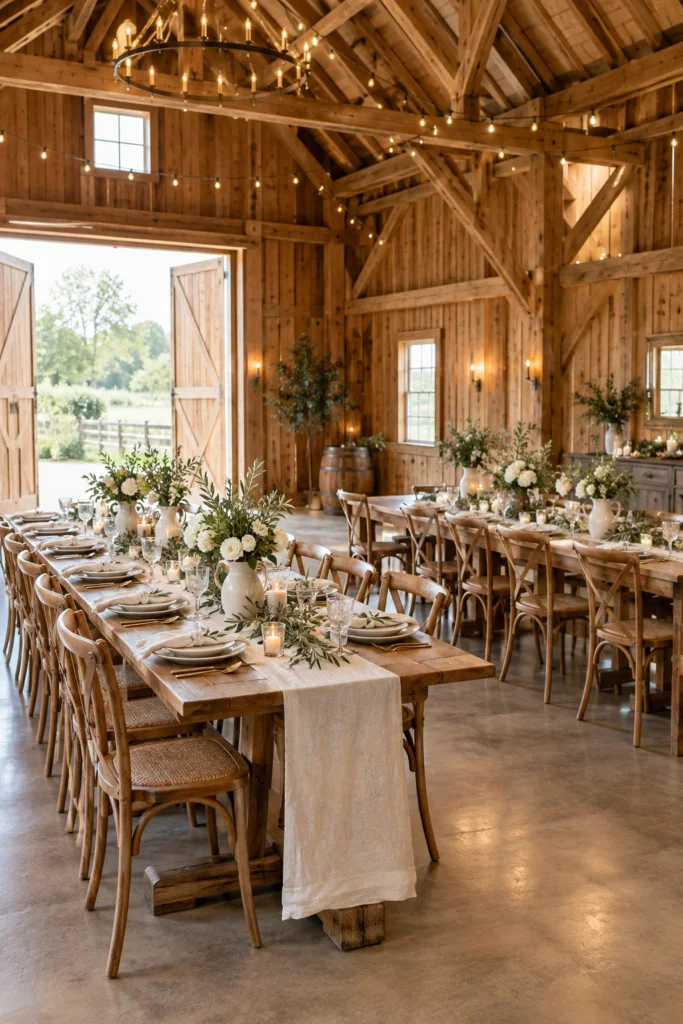
Color palette: Cream, olive, caramel, and natural wood. Best suited to: Barns, farm venues, country inns, and rural event spaces.
A rustic wedding reception can feel warm and polished with wooden tables, linen runners, stoneware plates, and flowers arranged in ceramic pitchers. Let exposed beams, old doors, or a countryside view provide the background.
Choose one material to repeat across the room, such as warm wood or matte pottery. This helps the reception feel connected without filling every surface with decorations.
Finish with a dessert table featuring your favorite pies, cakes, or family sweets, presented on simple stands at different heights.
Make it work: Check what the venue supplies before sourcing furniture. Matching the existing tables and chairs can simplify the whole design.
4. Wildflower Meadow
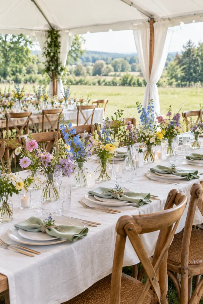
Color palette: Butter yellow, cornflower blue, lilac, soft pink, and green. Best suited to: Tented lawns, meadow venues, and informal garden receptions.
This theme is for couples who love flowers that look light, loose, and a little unexpected. Arrange small clusters of stems in bud vases, then repeat those colors in napkins or illustrated table numbers.
Keep the tablecloths simple so the flowers become the main event. Botanical place cards or a cake decorated with sugar flowers can carry the meadow idea into smaller details.
For an especially personal version, include a flower associated with your hometown or a place you love visiting together.
Make it work: Ask your florist for locally available stems that create the shape and colors you want. A meadow look does not require wild-picked flowers.
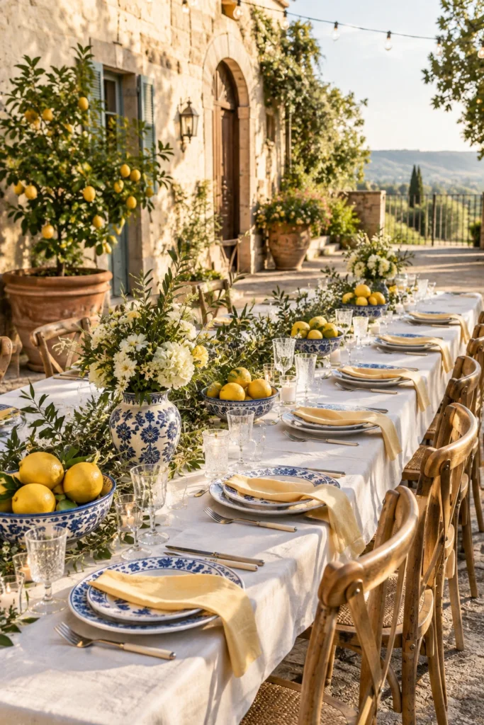
5. Italian Lemon Garden
Color palette: Lemon yellow, leaf green, cobalt blue, and white. Best suited to: Terraces, courtyards, garden restaurants, and summer receptions.
Blue-and-white ceramics, bowls of lemons, and crisp linens give this wedding reception theme its sunny character. Add greenery in loose arrangements and use yellow sparingly in napkins, flowers, or stationery.
Let the menu reinforce the feeling of a leisurely dinner. Think seasonal dishes, generous shared platters where practical, and a lemon dessert you both love.
If Italy is part of your story, work a real memory into the details: a place you visited, a favorite dish, or the restaurant where you celebrated an anniversary.
Make it work: Keep fruit arrangements compact so there is still room for plates, serving dishes, and conversation across the table.
6. Modern Black and White
Color palette: Black, white, and one optional metallic accent. Best suited to: Galleries, city hotels, contemporary restaurants, and lofts.
A black-and-white reception gets its impact from clear shapes and thoughtful repetition. Try white tablecloths, black napkins, simple flowers, and stationery with generous blank space.
Choose a single statement feature, such as a graphic dance floor or a sculptural arrangement behind the couple’s table. Keep the surrounding details quieter so that feature has room to stand out.
Make it work: Test a sample place setting in the venue. Black details need enough contrast and light to remain visible in the evening.
7. Pearls and Bows
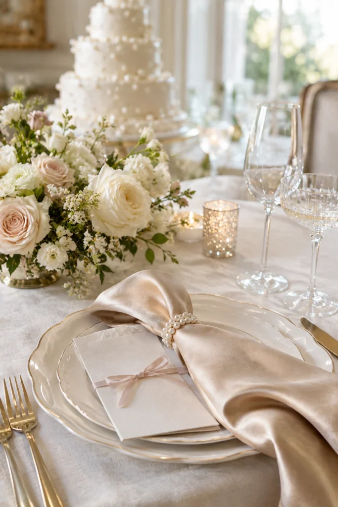
Color palette: Ivory, champagne, powder pink, and pearl white. Best suited to: Historic homes, light-filled ballrooms, and romantic dining rooms.
Delicate bows and pearl details create a soft, dressy reception without requiring oversized flowers. Tie ribbon around menus, add a bow to the cake stand, or use pearl-inspired napkin rings.
Choose two or three places for the motif to appear. For example, ribbon-tied menus, a bow on the couple’s chairs, and a cake with edible pearl decorations are enough to establish the look.
Make it work: Keep decorative strands and trailing ribbons away from plates, chair legs, and walkways.
8. Coastal Blue and White
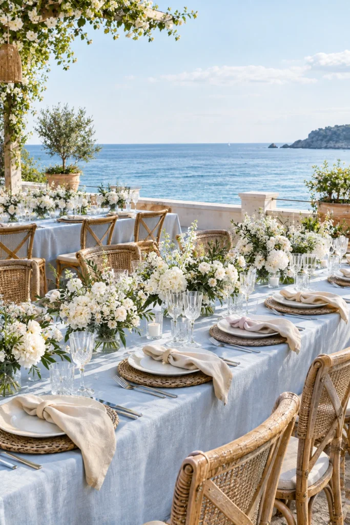
Color palette: Soft blue, white, sand, and natural rattan. Best suited to: Waterfront venues, beach clubs, lakeside spaces, and airy restaurants.
Build a coastal reception around the feeling of open skies and an unhurried meal by the water. Pale blue linens, white flowers, woven chargers, and clear glassware are a lovely starting point.
Use texture to give the tables depth. A linen napkin, a woven chair, and a softly curved plate can suggest the coast without needing shells at every setting.
A welcome drink in a pale blue glass or a dessert table near the view can become part of the experience.
Make it work: Secure paper items and choose stable centerpieces for breezy venues. Keep the water view open wherever possible.
9. Greenhouse Botanical
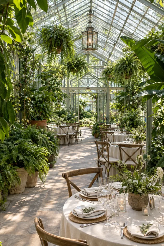
Color palette: Fern green, moss, cream, and clear glass. Best suited to: Greenhouses, conservatories, garden rooms, and spaces with large windows.
This theme puts greenery at the center of the celebration. Mix leafy plants with white flowers, simple table settings, and glass vessels that let the room feel bright.
Vary the scale: a few larger plants can frame the entrance, while smaller potted arrangements decorate the dining tables. Botanical illustrations on menus or table numbers provide a quiet finishing detail.
If plants are a shared hobby, use varieties you grow at home and explain their significance in a short welcome note.
Make it work: Visit at a similar time of day to your reception and ask about temperature control, shade, and how the light changes.
10. Terracotta Boho
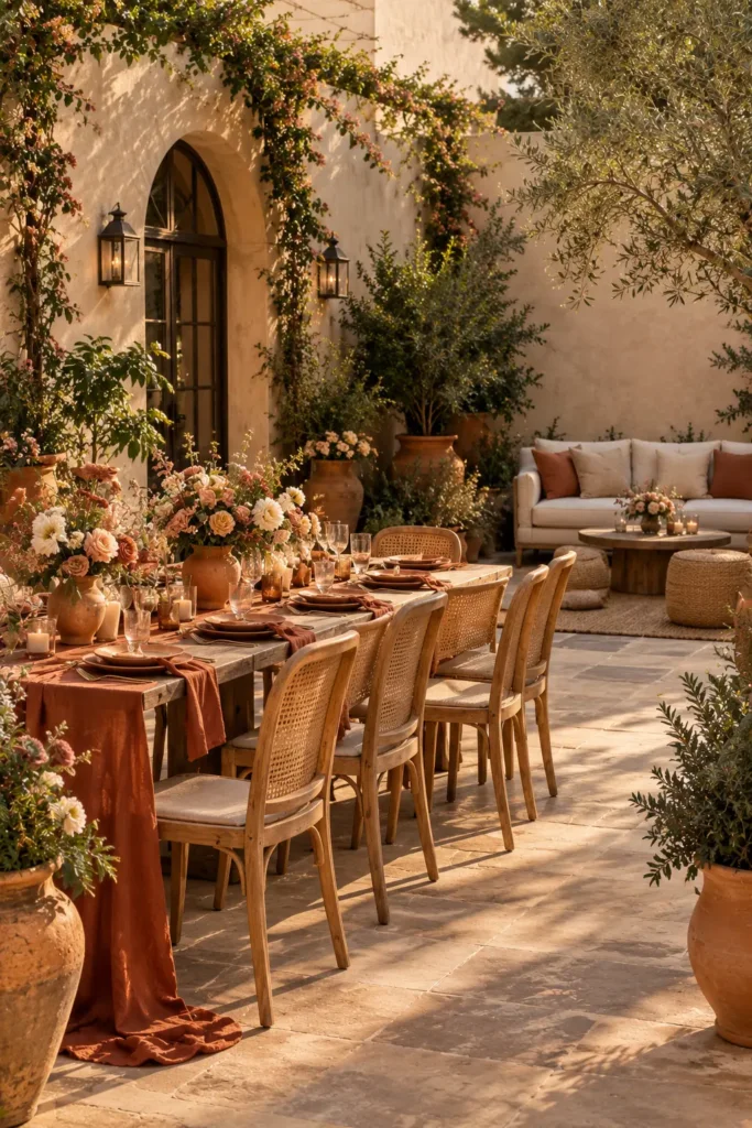
Color palette: Terracotta, rust, cream, dusty rose, and muted olive. Best suited to: Courtyards, desert venues, relaxed estates, and warm-toned interiors.
Terracotta brings warmth to the reception through clay vessels, textured linens, and flowers in earthy shades. Add woven details and a comfortable lounge corner to make the space feel inviting.
Keep the dining area practical with proper chairs and enough table space. You can create a relaxed mood through materials and color while still making dinner comfortable for everyone.
For a focal point, cluster a few large pottery pieces around the welcome display or cake table.
Make it work: Choose one main texture, such as linen or woven cane, and repeat it. Too many competing textures can make the room feel crowded.
11. Vintage Afternoon Tea
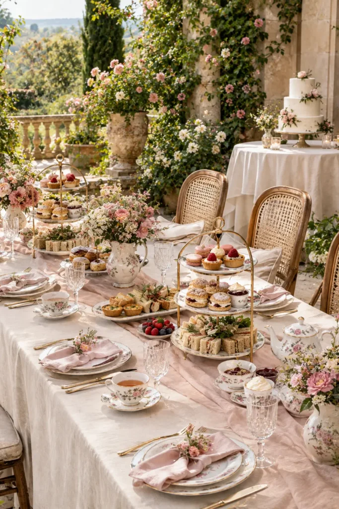
Color palette: Dusty rose, cream, muted lavender, and antique gold. Best suited to: Small gardens, historic houses, tearooms, and daytime receptions.
A vintage tea reception is sweet, intimate, and full of little details guests can enjoy up close. Use floral china, cake stands, linen napkins, and small arrangements in teapots or pitchers.
Plan a menu of savory bites, scones, pastries, and tea, with clear options for guests who prefer coffee or cold drinks. A small cutting cake can sit among the individual desserts.
The china can be mismatched while sharing a common color or floral pattern.
Make it work: Make the invitation clear about the reception timing and food format so guests know what kind of meal to expect.
12. Celestial Night Sky
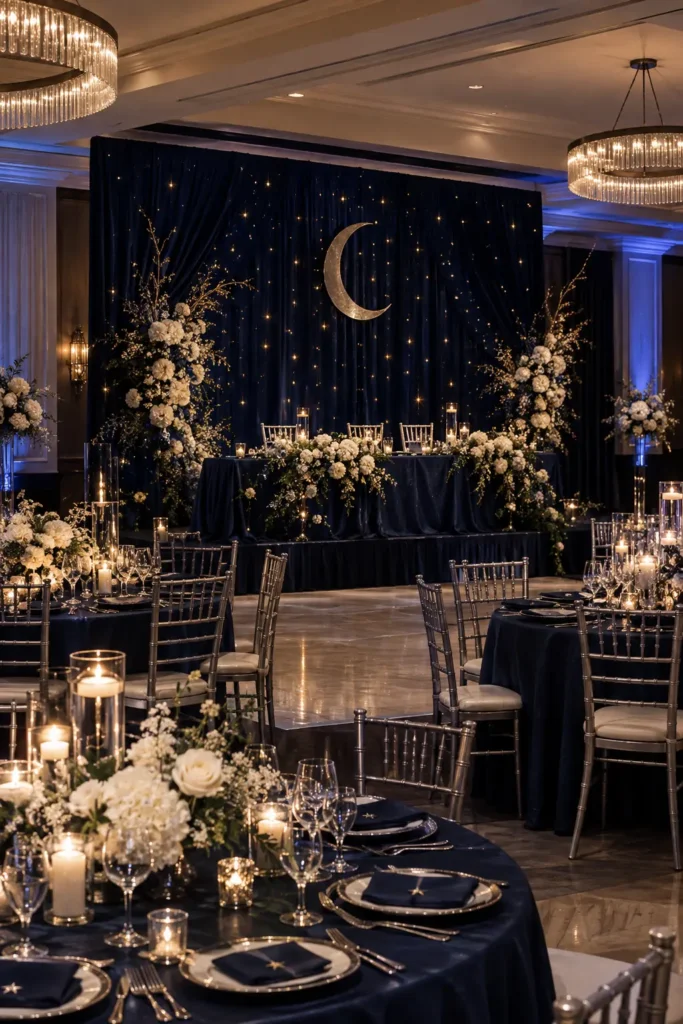
Color palette: Midnight blue, silver, soft gold, and ivory. Best suited to: Evening ballrooms, dark-walled venues, and indoor spaces with lighting flexibility.
Create the feeling of dinner beneath the stars with a deep blue base, tiny points of warm light, and a few crescent or constellation details.
Choose one strong celestial feature, such as a starry backdrop behind the couple’s table. Repeat the idea more quietly through metallic stationery or constellation-inspired table names.
A night-sky illustration based on your wedding date can become a personal keepsake as well as part of the decor.
Make it work: Balance atmospheric lighting with enough light to read menus, see food, and move through the room comfortably. Any suspended decor needs venue-approved installation.
13. Disco Garden Party
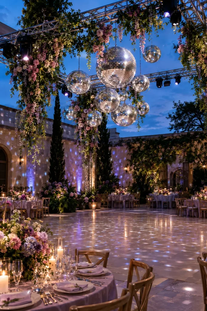
Color palette: Pink, lilac, leaf green, and mirror silver. Best suited to: Courtyards, tented receptions, lofts, and venues with a dedicated dance floor.
Pair abundant flowers with mirrored disco balls for a wedding reception that moves naturally from romantic dinner to a lively party.
Keep the dining tables relatively simple, then concentrate the drama above or beside the dance floor. A cluster of mirrored spheres, colorful flowers, and well-placed lighting gives the dancing area its own identity.
Add a song-request card to the RSVP process and work your shared favorites into the evening.
Make it work: Ask the venue or lighting team to handle hanging decor and lighting positions. A disco ball needs directed light to create its familiar scattered reflections.
14. Colorful Retro Celebration
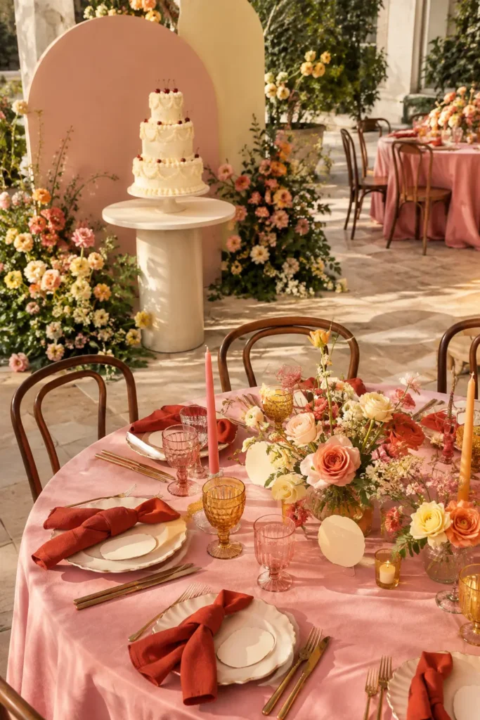
Color palette: Tomato red, peach, butter yellow, and warm pink. Best suited to: Creative event spaces, colorful restaurants, and casual city receptions.
Rounded stationery, playful stripes, colored glassware, and a vintage-style piped cake give this theme a cheerful character. Choose a small family of colors and repeat them through the room.
You might pair pink tablecloths with red napkins, or keep the linens neutral and make the flowers bright. One bold decision is easier to build around than a different color story on every table.
A photo corner with a curved backdrop can extend the theme without taking over the dining area.
Make it work: Decide which elements should feel retro. A cake, stationery set, and playlist may be all you need.
15. Parisian Bistro
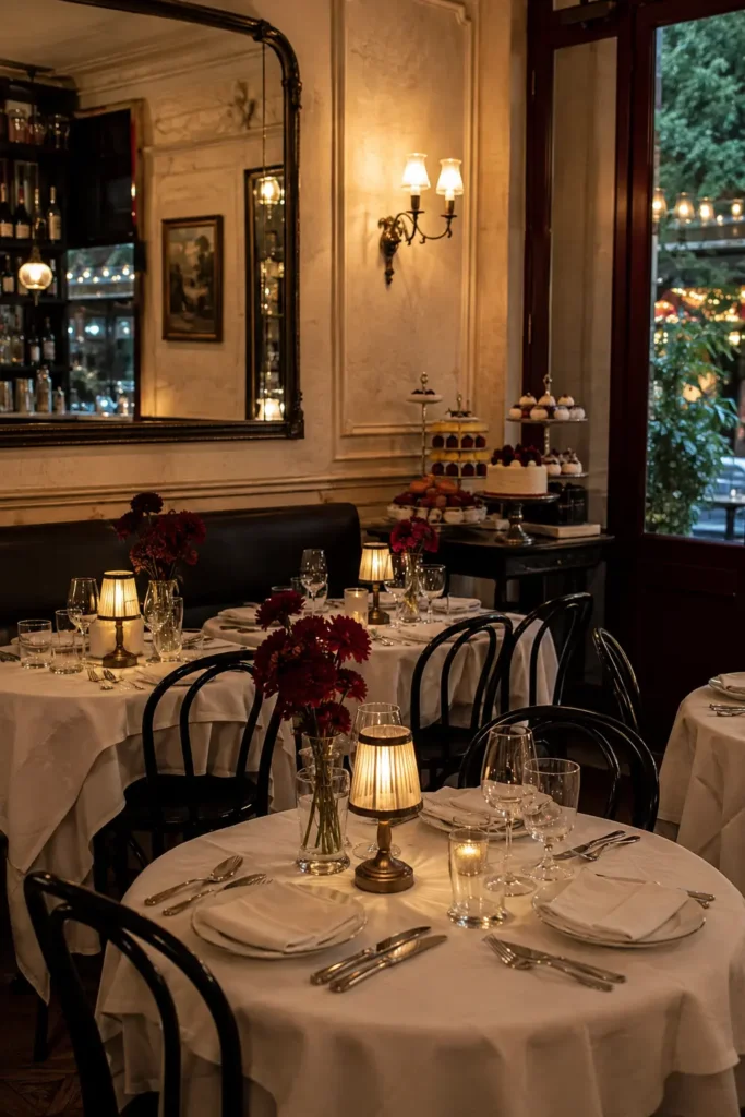
Color palette: Cream, black, burgundy, and warm brass. Best suited to: Restaurants, intimate courtyards, and small urban venues.
Imagine little tables, folded menus, flowers in narrow vases, and a room that feels welcoming before the first course arrives. A Parisian bistro theme works beautifully when you want the meal and conversation to shape the reception.
Use the venue’s chairs, mirrors, and architectural details as part of the design. Add a personal menu, a few lamps, and a dessert display with a clear focal point.
You could name tables after meaningful streets, neighborhoods, or places you have visited together.
Make it work: If you want dancing after dinner, confirm where it will happen and whether furniture must move between the two parts of the evening.
16. Enchanted Woodland
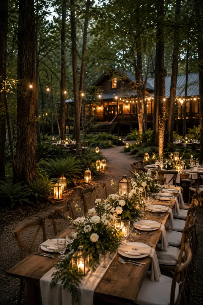
Color palette: Forest green, bark brown, ivory, and muted gold. Best suited to: Woodland venues, cabins, lodges, and timber-lined event spaces.
A woodland reception can feel quietly magical through layered greenery, warm lanterns, wooden tables, and small floral arrangements tucked between the place settings.
Use the surroundings to create depth. Trees beyond the dining area or timber walls behind the couple’s table can become part of the scene, leaving you free to keep the tables simple.
For a storybook detail, use botanical illustrations or tiny woodland motifs on the stationery.
Make it work: Plan clear, well-lit routes between the dining area, bathrooms, and transport. Keep loose decorative materials contained on tables or displays.
17. Jewel-Tone Glamour
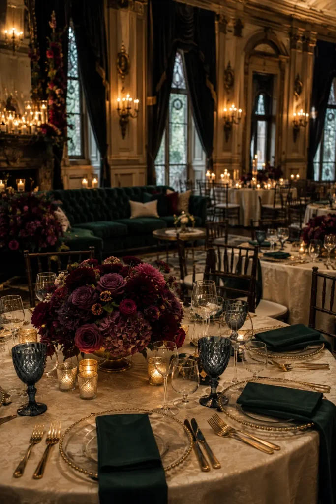
Color palette: Emerald, plum, sapphire, and antique gold. Best suited to: Ballrooms, historic hotels, formal halls, and evening receptions.
Deep colors can make a large room feel rich and intimate. Start with one jewel tone for the main fabric, then add two supporting shades through flowers, glassware, or stationery.
For example, emerald napkins, plum flowers, and a small gold detail at each setting create a strong look on neutral tablecloths. You can reserve velvet for a lounge area or the couple’s chairs if dressing every table feels excessive.
Choose warm lighting to bring the colors into the room after sunset.
Make it work: Request a sample arrangement and place setting. Dark flowers and fabrics need enough light and contrast to show their details.
18. Autumn Harvest
Color palette: Cinnamon, ochre, cranberry, cream, and warm brown. Best suited to: Barns, orchards, country houses, and fall receptions.
Build an autumn reception around the richness of the season: warm linens, textured flowers, amber glass, and small arrangements of pears or other decorative produce.
Choose a few seasonal elements with clear roles. Fruit can add shape to a centerpiece, while a cider station or seasonal dessert gives guests something to enjoy.
Let the food feel connected to the setting without requiring every dish to follow a strict theme. A favorite family dessert is a lovely addition here.
Make it work: Keep centerpieces compact and ask the catering team how decorative produce should be handled if you hope to use it afterward.
19. Winter Lodge Romance
Color palette: Evergreen, cream, walnut, and soft copper. Best suited to: Lodges, mountain venues, country inns, and rooms with fireplaces.
Create a cozy winter reception with evergreen arrangements, warm lamps, velvet ribbon, and a welcoming lounge area. A fireplace or timber wall can provide the main backdrop.
Use cream linens to lift the darker colors and repeat copper or warm brass in a few small details. A hot chocolate or coffee station adds to the atmosphere and gives guests somewhere to gather between dinner and dancing.
Keep seasonal references subtle if you want the room to feel distinct from a holiday party.
Make it work: Place lounge furniture where guests can sit comfortably without blocking access to the dining area, exits, or drinks station.
20. Literary Romance
Color palette: Parchment, ink blue, burgundy, and antique gold. Best suited to: Libraries that host events, historic homes, private dining rooms, and intimate venues.
For couples who connect over books, a literary wedding reception gives familiar objects a personal role. Use favorite titles as table names, bookmark-shaped place cards, and a guest book with space for longer messages.
Arrange a few books alongside flowers, keeping the titles meaningful. A small note explaining why you chose each book is more interesting than a table filled with unrelated volumes.
You can carry the theme into the menu with a simple chapter-style layout.
Make it work: Choose readable lettering for practical information. Guests should be able to find their table and understand the menu without deciphering decorative script.
21. Backyard Brunch
Color palette: Butter yellow, white, fresh green, and a touch of pale blue. Best suited to: Backyards, patios, small gardens, and casual daytime venues.
A brunch reception has an easy, cheerful rhythm. Think gingham napkins, simple flowers, coffee, chilled drinks, and tables arranged for relaxed conversation.
Build the menu around food you would be excited to share: pastries, fruit, breakfast favorites, or a more substantial lunch-style spread. Let the time of day guide how much food guests will expect.
One beautifully arranged drinks or dessert station can provide a focal point while the rest of the space stays simple.
Make it work: Plan shade, bathrooms, power, food service, and seating before buying decorations. A backyard reception still needs a complete event setup.
How to Choose Your Wedding Reception Theme
Start with the room you actually have
Look at the walls, flooring, furniture, windows, and surroundings. Choose a theme that uses the features you like. A greenhouse already provides the backdrop for a botanical reception; a small restaurant may already have the warmth you want for a supper club.
If you have not booked a venue, take your two favorite themes on venue visits and ask which would be practical in each space.
Describe the guest experience in three words
Try “warm, intimate, relaxed” or “colorful, energetic, playful.” Use those words to decide between ideas that look equally appealing in photos.
A theme should help you plan how the reception feels, including dinner, conversation, music, and the transition into dancing.
Choose a palette and one signature detail
Begin with two main colors, a neutral, and one detail people will remember. That might be blue-and-white ceramics, a starry backdrop, a collection of favorite books, or a flower-filled dance floor.
Repeat that detail selectively through the welcome area, tables, and one focal point. Leave some surfaces simple so the meaningful parts remain noticeable.
Price the design as a complete setup
Ask for quotes that include delivery, installation, removal, and any extra equipment. A modest-looking ceiling installation can involve more work than an elaborate-looking tabletop arrangement.
Decide which part matters most to you, then simplify lower-priority areas. Use the venue’s existing furniture where it suits the design and ask whether ceremony flowers can be moved to the reception within the schedule.
Check the plan from a guest’s seat
Look at a sample table setting from a seated position. Can guests see each other? Is there space for water glasses and bread plates? Are table numbers easy to spot?
Those small decisions help the theme feel comfortable as well as beautiful.
Wedding Reception Themes FAQ
What is the difference between a wedding theme and a color palette?
A wedding theme describes the overall style or experience, such as a garden party, literary dinner, or disco celebration. A color palette is the group of colors used to express it. The same blush-and-green palette could support a romantic garden reception or a playful disco garden, depending on the lighting, materials, and details.
Which wedding reception themes are easiest to keep simple?
Candlelit supper club, modern black and white, and backyard brunch are good starting points when they suit the venue. Their appearance can rely on repeated colors, modest table decorations, and a clear focal point. The venue, rentals, catering, and setup requirements will still determine the overall cost.
Can you combine two wedding reception themes?
Yes. Choose one main theme and borrow a small number of details from the second. A garden party can gain a disco dance floor, while a bistro reception can include literary table names. Keep the palette and materials consistent so the two ideas feel connected.
Do the ceremony and reception need the same theme?
They can share a color, flower, or design detail without having identical decor. A simple daytime ceremony can lead into a dramatic evening reception. Repeating one or two elements creates a connection while letting each part of the day have its own atmosphere.
What makes a wedding reception theme feel personal?
Use details that connect to your relationship: favorite books, meaningful places, family recipes, songs, or flowers with a story. Choose a few that guests can understand and enjoy. A thoughtful menu note or a table name with an explanation can say more than a room full of generic wedding decorations.
Choose the Celebration You Want to Be Part Of
The right wedding reception theme should make you excited to sit down, eat, talk, and celebrate with your favorite people. It might be a glowing winter lodge, a sunny lemon-filled courtyard, or a dance floor surrounded by flowers.
At MorningFable, we suggest saving your three favorite ideas first. Compare them with your venue, budget, and the kind of evening you both enjoy, then choose the details you would miss if they were not there. Save this list to your wedding board so you can return to the palettes and styling ideas as your plans take shape.
More Wedding Inspiration
Planning the bridal look too? Browse our minimalist wedding nail ideas for understated manicure inspiration, and explore our wedding dresses and attire ideas to coordinate the overall style.